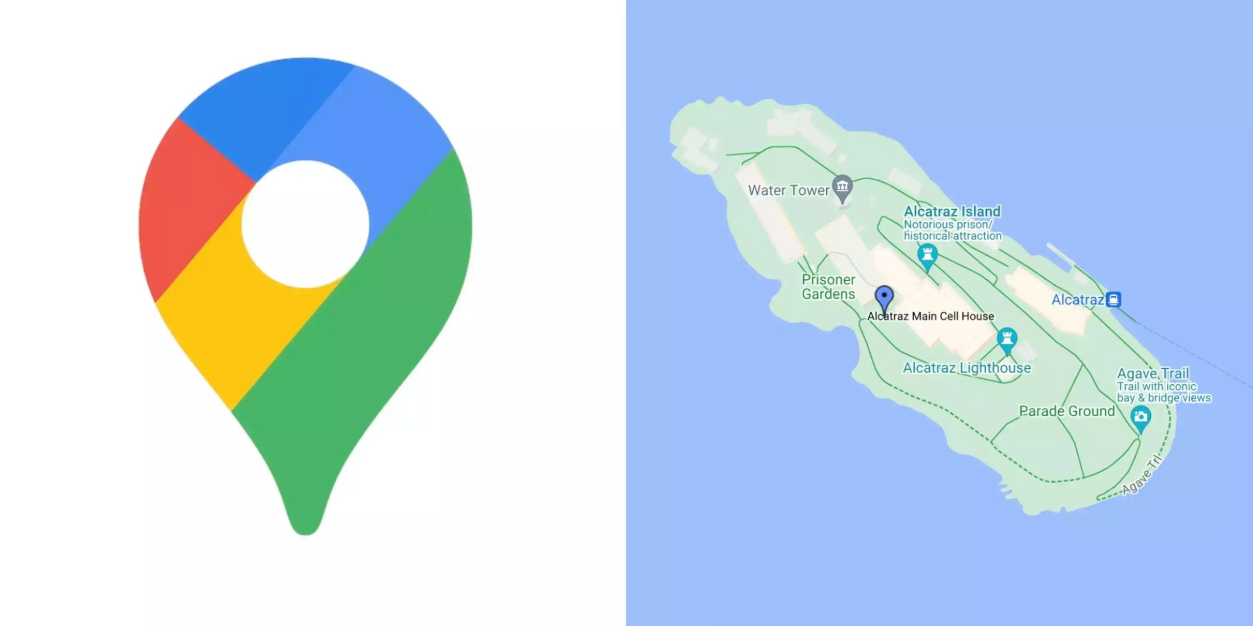
Google Maps has unveiled a new look, and not all of its users are pleased with the changes. Last week, the tech giant announced updates to its Maps app, including features like enhanced public transit directions and locations for electric vehicle charging stations. However, it’s the new color palette that’s causing a stir among users.
Former Google Maps designer Elizabeth Laraki tweeted her disapproval of the app’s new visual design, stating that it feels “colder, less accurate, and less human.” Other users also echoed her critiques, with one calling the new colors “computer generated” and another expressing confusion over the drastic change in color scheme.
Despite the negative reactions, some praised the update, claiming that it provides better contrast and is more visually appealing. However, Laraki believes that Google missed an opportunity to simplify the design of Maps.
Tech blogger John Gruber even compared Google Maps to Apple Maps, suggesting that users may have switched to Apple Maps for a good reason. As of now, Google and Laraki have not responded to requests for comments on the changes.

